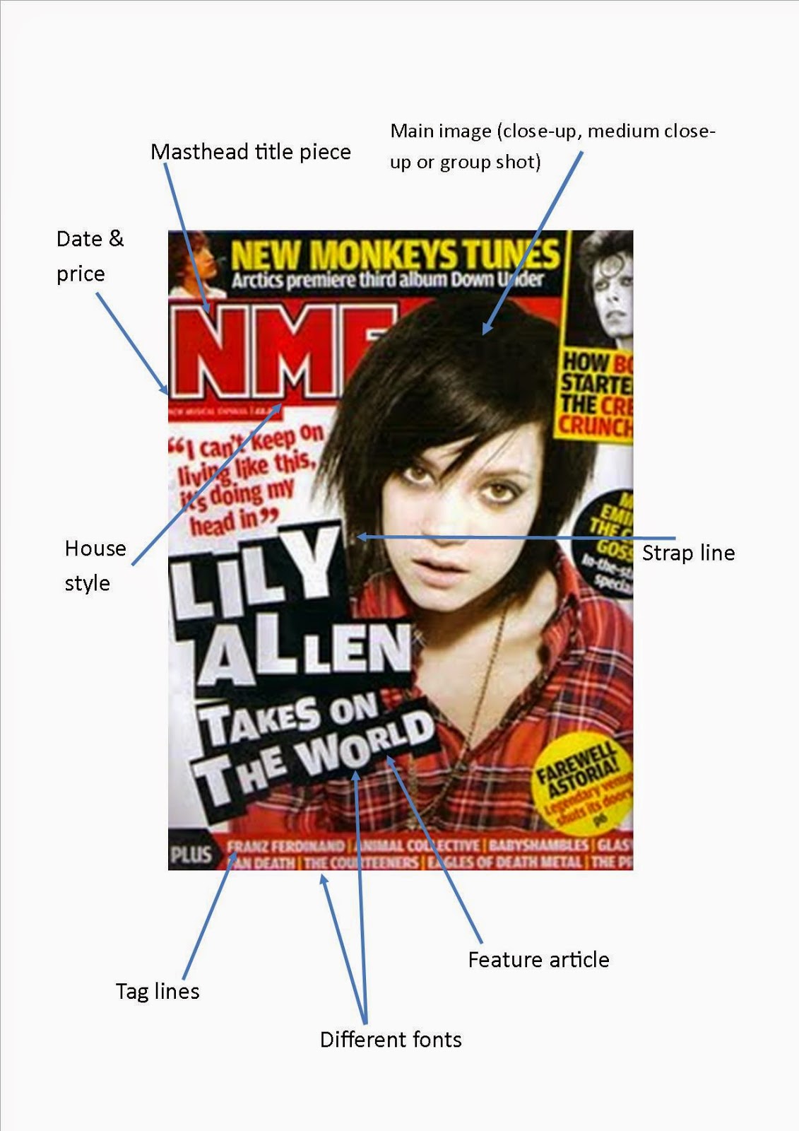


All of these music magazine covers have things in common. These features are the conventions of a music magazine cover and apply to most genres of music magazine. The first thing they have in common is the masthead title piece. On all of these magazines the masthead title piece is at the top of the magazine and if it doesn't stretch all the way across the top it is to the left. This makes the magazine look organised and makes the focus go straight the to magazine title so the magazine will be recognised easier as the title is seen more. Another thing these magazines have in common in the main image. As with the college magazines studied in the preliminary task the main image is a medium close up which allows the person on the front cover to be the main focus without the photograph being too big or too small where you can not see the person in the photograph.However with music magazines it can also be conventional for the photograph to be a close-up or a group shot. This would also be conventional as it would still allow you to see the person or people in the photograph without it ruining the look of the magazine in some genres. All of these magazines also contain a strap line on the front cover. This brings focus to the main person usually in the main image which then shows the buyer who is in the magazine so they can choose whether they want to buy it easier and quicker.The feature article is also conventional on all of these magazine covers. They all have larger text for the feature article showing that this is the main and most important article in the issue of the magazine. All of the magazines use something to draw attention to the main article e.g. In top of the pops the main article is shown in a graphical shape showing that it is important. All of these magazines have a obvious house style with colour. This is conventional as it makes the magazine more recognisable and more people will therefore buy the magazine. All of these magazine covers also contain a barcode with the price, date, and website next to it. This is conventional as it is small and so doesn't draw the most attention and still gives the buyer the information they need to buy the magazine.


These contents pages all use the conventions of a music magazine contents page. The first convention that they all have in common is the use of columns to organise the information about the contents of the magazine. The columns act as a way of making it easy to find what features are in the magazine and as it is a music magazine this is vital to let the reader know who and what is in the magazine as the magazine would also act as an advertisement for the artists featured. Another convention is the contents title. This is conventionally at the top of the page and large compared to the rest of the text on the page. This is so that it is obvious that it is a contents page so people can easily find the place where they can find the page numbers of all the features in the magazine. The contents pages also all contain the main image which is usually larger than all other images on the page and central to show it's importance. The image should be relevant to the main feature of the magazine such as a person from an interview.


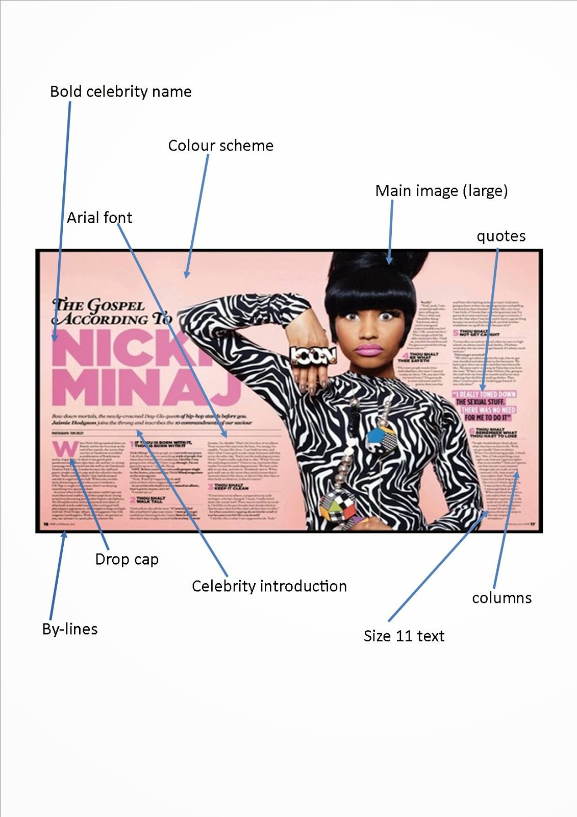
The two page spread of a music magazine is usually the main article so therefore it helps to follow conventions as this will make it look professional and will help it to meet it's aims as a magazine. One convention that all of these double page spreads have in common is the main image. The main image is usually the full length of the page and to the left of the feature (however with some magazines such as the first and third example the image is to the right).
The person in the image should be looking directly at the reader which makes the reader feel more involved and therefore more interested. Another convention used by these double page spreads is the bold celebrity name and celebrity introduction. This is used so that the reader can clearly see who is featured and so that they know something about them if they do not know who they are. The double page spreads also follow the same house style as the covers and the contents page so that it says recognisable. As with the contents page the information is organised into columns which makes the feature look neat and well organised. They all have quotes from the person in the feature which are larger and bolder than the rest of the text. This is to get the reader interested before they read the rest of the feature.
No comments:
Post a Comment