The magazine i have chosen to do a LIIAR analysis on is NME. I have chosen this magazine as it fits in well with my genre choice.
(front cover)
language
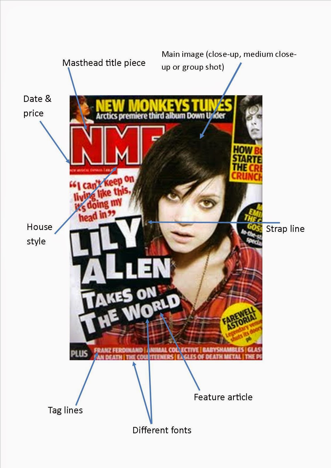
Denotation- The magazine cover contains a lot of bright colours such as red and yellow. The text on the front cover is also big and bold making it stand out. The house style for this magazine cover appears to be red, yellow, and black. The title of the magazine is in the top left corner and in big lettering. The main image on the cover is large and the featured person is looking at the camera.
connotation- The red and yellow bright colours may relate to the genre of the magazine. The red may symbolize the passion for the genre. The colours are bright which makes the magazine noticeable which would make more people buy it. The title is big as this makes it recognisable to the audience. The title is always the same on every magazine (sometimes the colours are different) which makes it recognisable and more well known. In the main image the person is looking directly at the camera which makes it look as if they are looking at the reader. This makes the reader feel more involved and directly addressed which makes it more likely that they are going to buy the magazine.
media language
- masthead- The masthead is the title at the top of the magazine. It follows conventions of a music magazine as it is in the top left corner and is large and bold making it noticeable.
- selling line- The selling line for NME is "new musical express". The selling line of the magazine makes it easier to recognise the genre of the magazine and for people to know the full title of the magazine.
- pull quotes- The pull quote on the front cover of this magazine is "how can we get any bigger? Well, i might run for president". The pull quote is a clue as to the content of the magazine and is usually quite large, bold, and near the main image.
- cover lines- The cover lines on a magazine cover tell us more about the features and topics covered in the magazine. For example the cover lines of this magazine are, "yeah yeah yeah's, fall out boy, white lies, bloc party". This shows the reader what features in the magazine before they have read it.
- main image- The main image on this front cover is a mid shot of a member of kings of Leon. The person in the image is looking at the camera. He is wearing a black leather jacket which is conventional for his genre of music.
- secondary images- The secondary images on the front cover are members of the arctic monkeys and radiohead. The secondary images are used to illustrate the features that are in the magazine and give the audience more than just words to decide if they want to buy the magazine. They also make the magazine look more attractive.
- plug- The plug is used to make a feature that the audience may be particularly interested in stand out, for example the plug for this magazine is " reading 2009 and Leeds 2009" .
- bar code- The bar code for this magazine is conventional as it shows the price, issue number, and date of release of the magazine.
institution
- The institution that publishes NME is IPC media. IPC media is owned by Time inc. UK which is the publishing section of Times Warner inc.The job of IPC is to publish and effectively advertise it's magazines such as NME. The name or logo of the media company is usually found somewhere in the magazine to help people recognise the company. The company sells over 350 million copies of their magazines every year
Ideology
NME magazine is a music magazine which focuses on genres such as rock, indie, and alternative. This is shown by the look of the magazine and the contents. For example, The featured artist on the cover (for this magazine it is a member of Kings of Leon). It is also shown by the colours of the magazine cover, For example black and red. These colours are typically associated with these genres which shows that these are the genres that the magazine features.The magazine often focuses on artists who were more famous in the past.
audience
The target audience of the magazine is both men and women however the magazine is more popular with men as the genres of the magazine are stereo typically more male.
The age range that this magazine is aimed at is 18-34 years old.The target audience is shown in the magazine by the dark colours which are stereo typically more male and the featured artists which are often more popular with a male audience.
representation
The artist on the front cover is wearing a black leather jacket and his hair is quite straight and flat. He has quite a serious expression on his face which represents the genre. He has a short beard which may also represent the genre. The way the artist is presented is stereotypical for the genres of the magazine and make it easier to identify them.
(contents page)
language
Denotation- The magazine contents page contains a lot of bright colours such as red and yellow. The text on the contents page is big and bold for more important text making it stand out and smaller for text that doesn't need to stand out as much. The house style for this magazine contents page appears to be red, yellow, and black. The title of the magazine is in the top left corner and in big lettering which is consistent with the front cover. The main image on the contents page is large and central.The featured people are the people who are in a big or main feature of the magazine.
connotation-The red and yellow bright colours may relate to the genre of the magazine. The red may symbolize the passion for the genre. The colours are bright which makes the magazine stand out. The title is continued on the contents page which would make the magazine recognisable. The title is always the same on every magazine (sometimes the colours are different) which makes it recognisable and more well known. In the main image the people are playing their instruments which further illustrates the genre and also shows the reader a bit more about the featured artists.
media language
- contents title- For this contents page the title is "NME this week" This shows the reader that they can find information about whats in the magazine there. It also tells the reader that the magazine is published and available every week.
- features- The features are listed in columns. This keeps everything simple and neat which looks professional. The columns all have individual titles such as "band index" and "news". This helps the reader find what they are looking for quicker and easier. The text of the features is bold which makes it easier for the reader to identify the features they are interested in
- date and website- The date of the magazines release is featured at the top of the page underneath the title. The contents page would also conventionally have the magazines website featured however this contents page does not.
- main image- The main image for this magazine is a group shot of the featured artists performing. The image is central and larger than other images to show that it is the main image and to direct readers to the main feature of the magazine.
- pull quote- The pull quotes for this magazine are in the information about the main article underneath the main image. The pull quotes give the reader an idea of what the main feature will contain.
- secondary images- The secondary images on the contents page conventionally contain other artists featured in the magazine. This gives the reader an idea about who is featured in the magazine. This contents page does not contain secondary images other than those of other NME magazines.
institution
- The institution that publishes NME is IPC media. IPC media is owned by Time inc. UK which is the publishing section of Times Warner inc.The job of IPC is to publish and effectively advertise it's magazines such as NME. The name or logo of the media company is usually found somewhere in the magazine to help people recognise the company. The company sells over 350 million copies of their magazines every year.
Ideology
NME magazine is a music magazine which focuses on genres such as rock, indie, and alternative. This is shown by the look of the magazine and the contents. For example, The featured artist on the contents page (for this magazine it is kasabian). It is also shown by the colours of the magazine contents page, For example black and red. These colours are typically associated with these genres which shows that these are the genres that the magazine features.The magazine often focuses on artists who were more famous in the past.
audience
The target audience of the magazine is both men and women however the magazine is more popular with men as the genres of the magazine are stereo typically more male.
The age range that this magazine is aimed at is 18-34 years old. The target audience is shown in the magazine by the dark colours which are stereo typically more male and the featured artists which are often more popular with a male audience.
representation
Kasabian are the featured artists on this contents page. The image is a group shot of them performing in a church. The genre of the band is represented by the presence of the bands instruments in the image. The group are wearing dark colours and their hair is quite messy. This also represents the genre of the band.
(double page spread)
language
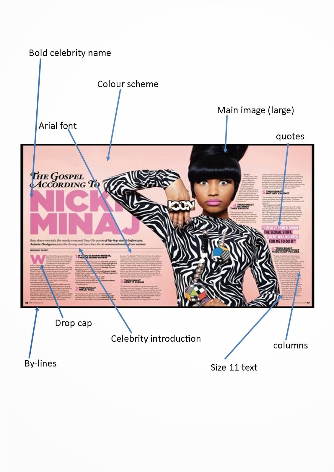
Denotation- The double page spread contains a lot of bright colours such orange. The text on the double page spread is big and bold for the quotes making it stand out The interview is quote small which ensures that it can fit on the page. The house style for this double page spread appears to be orange and white. The main image on the double page spread is large and the featured people are looking at the camera.
connotation-The bright colours may relate to the genre of the magazine. The bold colours may symbolise volume as the genres of the magazine are typically loud. . The main quote form the interview is big as this makes it stand out to the audience. In the main image the people are looking directly at the camera which makes it look as if they are looking at the reader. This makes the reader feel more involved and directly addressed which makes it more likely that they are going to buy the magazine.
media language
- title- The title is often a quote from the featured artist which gives the reader an idea about what is in the feature before they read it. The font is large so that it stands out and it features the name of the band in the main image which shows the reader who the interview is with.
- introduction- There is a brief introduction at the top of the page to tell the reader what the interview is about before they read it. This helps them decide if they want to read it. The name of the band is also repeated for clarification that it is oasis featuring in the interview.
- font- The font of the interview is written in a simple font which makes is easier to read. The first letter of the interview is written in large text which is conventional for the start of a magazine interview so readers recognise that it is an interview.
- main image- The main image is on the left of the page which is conventional for a double page spread. The image is a group shot showing all members of the band looking directly at the camera. The main image is large so that the reader can clearly see that the band featured in the image illustrates the interview.
institution
-The institution that publishes NME is IPC media. IPC media is owned by Time inc. UK which is the publishing section of Times Warner inc.The job of IPC is to publish and effectively advertise it's magazines such as NME. The name or logo of the media company is usually found somewhere in the magazine to help people recognise the company. The company sells over 350 million copies of their magazines every year.
Ideology
NME magazine is a music magazine which focuses on genres such as rock, indie, and alternative. This is shown by the look of the magazine and the contents. For example, The featured artist on the double page spread (for this magazine it is oasis). It is also shown by the colours of the magazine double page spread, For example, orange and black. These colours are typically associated with these genres which shows that these are the genres that the magazine features.The magazine often focuses on artists who were more famous in the past.
audience
The target audience of the magazine is both men and women however the magazine is more popular with men as the genres of the magazine are stereo typically more male.
The age range that this magazine is aimed at is 18-34 years old. The target audience is shown in the magazine by the dark colours which are stereo typically more male and the featured artists which are often more popular with a male audience.
representation
Oasis are the featured artists on this double page spread. The image is a group shot of them looking directly at the camera. The genre of the band is represented by the serious expressions of the band as their genre is not typically associated with images of the band smiling. The group are wearing dark colours and their hair is quite messy. This also represents the genre of the band.